
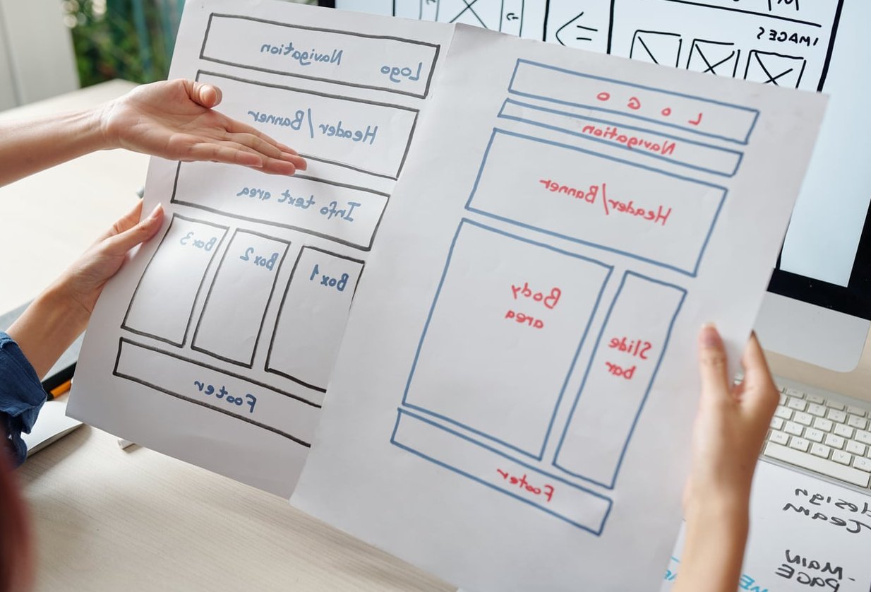
Most articles about 404 page design ideas hand you a gallery of cute illustrations and leave you to guess the rest. Pretty pictures are the easy part. The hard part is layout: what goes above the fold, what the user clicks next, and how you stop a broken link from becoming a closed tab.
At Matthew Daniels Design we treat the 404 as a real page with a real job. It has one conversion goal: get the visitor back into your site. Below are 10 approaches we see working in the wild, each one broken down by the layout elements that do the heavy lifting, followed by a checklist and the mistakes that quietly kill recovery rates.
Why Your 404 Page Deserves a Real Design Brief
A 404 means the server found nothing at that URL. Visitors arrive there for reasons you rarely control: an old link on someone else’s blog, a mistyped address, a stale bookmark, a URL structure you changed two redesigns ago, or a social post that lost its query string.
The visitor’s mental state matters. They wanted something specific. They are not browsing, they are hunting. That single fact should drive every decision on the page:
- They need reassurance that your site still works and they are not lost on the wrong domain
- They need an action, not an apology paragraph
- They need it fast, because a dead end plus a slow page equals a bounce
A well built error page also protects your brand. If a potential client hits a generic grey “Not Found” wall on a design studio website, that is the impression they leave with.
The 10 404 Page Design Ideas, Broken Down by Layout
1. The Search-First 404
Best for content-heavy sites, blogs, documentation and anything with hundreds of URLs.
The layout puts a single wide search field directly under a short headline. No illustration competing for attention, no menu of twelve links. Just “We couldn’t find that page. Try searching instead.” and a field with the cursor already focused.
Layout elements: short headline, one search input at roughly 60 to 70 percent of container width, a submit button with a verb label, three or four suggested search terms underneath as clickable chips.
Advanced touch: parse the broken URL and pre-fill the search box with words pulled from the slug. Someone landing on /blog/website-redesign-checklsit should see “website redesign checklist” already typed in. It feels like magic and costs a few lines of code.
2. The Popular Links Grid
Best for ecommerce, service sites and portfolios with a handful of high-value destinations.
Instead of a search field doing all the work, you present four to six cards linking to your best performing pages. Pull the list from your analytics, not from your own assumptions about what matters.
Layout elements: headline, one line of explanation, a two by three or two by two card grid with small thumbnails and clear labels, and a secondary text link back to the homepage.
Keep the grid genuinely short. Eight options is a menu. Four options is a recommendation, and recommendations get clicked.
3. The On-Brand Illustration 404
Best for consumer brands, agencies and anyone with a mascot or established illustration style.
This is the classic gallery-worthy 404, but the discipline is in the proportions. The illustration sits left or above, occupying no more than half the visible area, with the copy and buttons holding the other half. The art is the personality, the right column is the function.
Layout elements: two column split on desktop that stacks on mobile, illustration in your brand palette, headline with a light touch of humour, one primary button, one secondary link, plus the full site navigation kept intact above. wix.com has covered this at length.
Warning: illustration files are often the reason 404 pages load slowly. Ship SVG where you can, compress raster images hard, and never let the art block the render of the buttons.
4. The Playful Interactive 404
Best for creative studios, gaming, and brands whose audience expects delight.
A tiny game, a draggable element, a canvas the user can scribble on. Dribbble’s version has long been the reference point for this genre and it still gets shared.
Layout elements: the interactive canvas sits in a contained block, never full bleed, with a persistent header and a fixed row of exit links underneath so the toy never traps anyone.
Only build this if you can commit to keeping it light. An interactive 404 that ships 400 KB of JavaScript is a worse experience than a plain paragraph of text.
5. The Editorial 404 With Latest Posts
Best for blogs, publishers and newsletters.
Treat the error page as a mini homepage. A short message at the top, then your three most recent articles in the same card format used across the site, then the newsletter signup you use everywhere else. The same instinct shows in the work of a studio that gets this right.
Layout elements: brief message, reused post card component, category links as a horizontal row, email capture block at the bottom.
The advantage here is maintenance. Because the posts are pulled dynamically, the page never goes stale, which is the quiet failure mode of hand-coded 404s.
6. The Contact Prompt 404
Best for B2B, consultancies, high-ticket services and small sites where every visitor counts.
If someone was looking for something specific on a service site, the fastest path is a human. This layout leads with an invitation: “Tell us what you were looking for and we’ll send you the link.”
Layout elements: headline, a single short field or two field mini-form, direct email address and phone number in plain text, plus links to your main service pages below the fold.
Two extra benefits. You collect real intent data about what people expected to find, and you occasionally turn a broken link into an enquiry.
7. The Ecommerce Recovery 404
Best for stores where a discontinued product URL is the most common source of errors.
A shopper hitting a dead product page is a shopper with a wallet open. Do not send them to the homepage.
Layout elements: message acknowledging the item may be unavailable, a product search field, a row of best sellers or similar items, category navigation, and a persistent cart icon showing anything already added. elementor.com has covered this at length.
Where you can, map old product URLs to their category page with a 301 redirect instead. The 404 is your safety net for everything you miss.
8. The Minimal Typographic 404
Best for portfolios, architecture, fashion and any brand built on restraint.
Large type, generous whitespace, no illustration at all. The whole design lives in the typeface, the scale and the spacing. Done well, it reads as confidence.
Layout elements: oversized “404” or a single sentence set large, one line of body copy, two underlined text links, and the standard site header. That is the entire page.
This variant is also the fastest to build and the easiest to keep accessible, which is why it is our default recommendation when a client’s budget is tight.
9. The Diagnostic 404
Best for SaaS products, web apps, documentation and developer tools.
Technical audiences want facts. GitHub set the tone here: state the status code plainly, tell the user what to check, and link to the places that help.
Layout elements: status code stated clearly, a short bulleted list of likely causes (URL typed incorrectly, page moved, you may need to sign in, permission required), a docs search, a status page link, and a support contact.
The “you may need to sign in” line matters more than people realise. A logged-out user hitting a gated URL sees a 404, blames your product, and files a bug that was never a bug.
10. The Auto-Suggest 404
Best for large sites with deep URL structures and frequent content churn.
The smartest 404 tries to guess. Run a fuzzy match between the requested slug and your existing URLs, then present the closest matches as a short list: “Did you mean one of these?”
Layout elements: headline, the requested URL echoed back in monospace so the user can see the typo, two or three suggested matches with page titles and short descriptions, search field as a fallback. A comparable breakdown sits on 404s.design.
Echoing the URL back is a small detail with outsized value. Half the time the visitor spots their own mistake immediately and fixes it themselves.

Comparing the Approaches
| Approach | Best suited to | Primary element | Build effort |
|---|---|---|---|
| Search-first | Blogs, docs, large sites | Search field | Low |
| Popular links grid | Service sites, portfolios | Card grid | Low |
| On-brand illustration | Consumer brands, agencies | Artwork plus CTA | Medium |
| Playful interactive | Creative studios, gaming | Interactive canvas | High |
| Editorial with latest posts | Publishers, newsletters | Dynamic post feed | Low |
| Contact prompt | B2B, consultancies | Mini form | Medium |
| Ecommerce recovery | Online stores | Product suggestions | Medium |
| Minimal typographic | Portfolios, fashion | Type and spacing | Very low |
| Diagnostic | SaaS, developer tools | Cause checklist | Low |
| Auto-suggest | Large, changing sites | Fuzzy URL matching | High |
The 404 Page Checklist: What Every Error Page Needs
Whichever direction you take visually, these items are non-negotiable. Run your current page against the list.
- The full site navigation, untouched. Same header, same menu, same footer as every other page. This is the single most common failure and the most damaging.
- A plain statement that the page was not found. Human language beats jargon. “This page doesn’t exist” works.
- One obvious primary action. A search field or a button back to a hub page. Not five equal options.
- Your logo, linked to the homepage. Confirms the visitor is still on the right domain.
- A route to a human. Contact link, email address or chat entry point.
- The correct HTTP status code. The page must return 404 (or 410 for permanently removed content), never 200.
- Brand consistency. Same fonts, colours, spacing and tone of voice as the rest of the site.
- A mobile layout that works. Test it at 375 px wide. Most illustration-led 404s break here.
- Accessibility basics. Real heading hierarchy, focus states on links, alt text on the illustration, contrast that passes WCAG AA.
- Fast load. Under one second on a 4G connection. Skip heavy fonts, skip video, lazy load anything decorative.
- No indexing. Let Google see the 404 status; do not create a soft 404 that competes in search results.
- Analytics tracking. Log the broken URL and the referrer so you can fix the source, plus track which exit link gets clicked.
A Quick Note on Measurement
A 404 page without tracking is a design you can never improve. Set up an event that records the requested path and the referring page. After a month you will usually find that a small handful of broken URLs generate most of your errors, and a few 301 redirects will remove the problem entirely.
The metric to watch is your 404 recovery rate: the percentage of sessions that continue to another page after hitting the error. Anything under 40 percent means the layout is not doing its job.
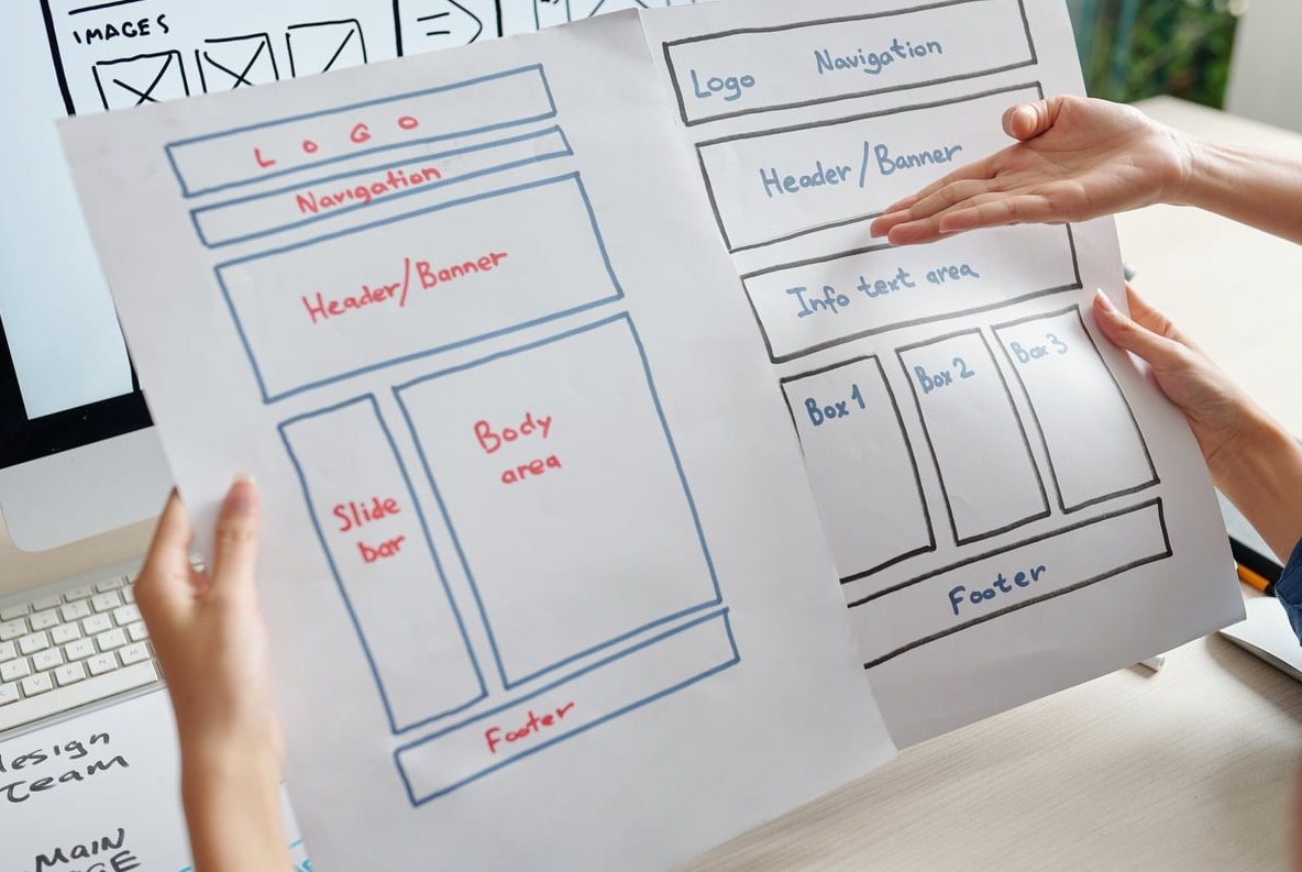
Common 404 Mistakes That Cost You Visitors
Stripping the Navigation
Designers do this because it looks cleaner in a portfolio shot. In practice you have removed every exit except the back button, and the back button sends the visitor to whatever site sent them to you. Keep the header and footer.
Shipping the Default Server Message
The bare “Not Found. The requested URL was not found on this server.” wall tells the visitor your site is broken and possibly unmaintained. It also leaks server details you would rather not publish. Any custom page beats it.
Returning a 200 Status
If your error page loads with a 200 OK, search engines treat it as legitimate content. That is a soft 404, and at scale it wastes crawl budget and puts thin duplicate pages into the index. Check with your browser network tab or a header checker.
Auto-Redirecting to the Homepage
Silently bouncing every bad URL to the homepage feels helpful and is not. The visitor loses the information that something was missing, cannot tell whether they mistyped, and lands somewhere with no relation to their intent. Google also flags these as soft 404s.
Jokes Without Function
Humour is fine. Humour instead of navigation is not. If the funniest thing on the page is also the only thing on the page, you have built a poster, not an interface.
Blaming the User
Avoid “You have entered an invalid URL.” It might be true and it is still the wrong tone. Neutral phrasing keeps the visitor on your side.
Forgetting Multilingual and Logged-In States
If your site has language folders, each one needs an error page in that language. If it has a member area, the 404 needs to work for logged-in users without dumping them out of their session.
Set and Forget
Hard-coded “popular links” go stale within a year. Pull them dynamically or diary a review every six months alongside your broken link audit.

How to Build Yours in an Afternoon
- Pull your data. Open your analytics and crawl reports, list the top 20 URLs currently returning 404, and note the referrers.
- Fix what you can with redirects. Anything with a clear modern equivalent gets a 301. The 404 page handles the rest.
- Choose one approach above based on your site type, not on which gallery example you liked most.
- Reuse existing components. Your header, your search block, your card component, your button styles. Faster to build, automatically on brand.
- Write the copy first. Headline, one supporting line, button label. If it works as plain text, the design will work too.
- Wire up the template. In WordPress that is 404.php in your theme, or the 404 template in your block theme. Most builders have a dedicated setting for it.
- Test properly. Visit a nonsense URL, confirm the status code is 404, check mobile, tab through with a keyboard, and measure load time.
- Add tracking, then review in 30 days.
FAQ
What should a good 404 page include?
A clear message that the page was not found, your standard site navigation and logo, one primary action such as a search field or a link to a main hub page, a few relevant suggested destinations, a contact route, and consistent branding. Technically it must return a real 404 status code and load quickly on mobile.
How do I design a 404 page from scratch?
Start with the visitor’s intent rather than the illustration. Decide the single most useful next step for your type of site: search for content-heavy sites, popular links for service sites, product suggestions for stores. Build the layout around that one element, reuse your existing header, footer and components for consistency, then add personality through copy and artwork once the function is settled.
Should a 404 page be indexed by Google?
No. It should return the 404 status code so search engines understand the content is gone and drop the URL from the index over time. You do not need a noindex tag when the status code is correct. What you must avoid is serving the error page with a 200 status, which creates a soft 404.
Is it better to redirect a broken URL or show a 404?
Redirect when there is a genuinely equivalent page, using a 301. Show a 404 when the content is simply gone and no close match exists. Blanket redirects of every missing URL to the homepage confuse visitors and are treated as soft 404s by search engines. Use 410 Gone when you have deliberately and permanently removed something.
Do 404 pages hurt SEO?
The existence of 404s is normal and does not carry a penalty. The problems come from volume and context: large numbers of broken internal links waste crawl budget and frustrate users, and valuable external links pointing at dead URLs waste authority you already earned. Audit regularly, redirect what deserves redirecting, and make the error page useful for everything else.
How often should I review my 404 page?
Review the page itself every six months to confirm links, suggestions and branding are current, and check your broken URL report monthly so you can redirect high-traffic errors quickly.
Turning Dead Ends Into Second Chances
The best 404 page design ideas share one trait: they respect the visitor’s original goal. Illustration, humour and animation are the surface. Underneath, every strong error page answers three questions fast. What happened? Where can I go? Who can help?
Get those three right, keep the navigation intact, return the correct status code, and your error page stops being a leak. If you want a second pair of eyes on yours, or a full audit of the broken links feeding it, get in touch with the team at Matthew Daniels Design.